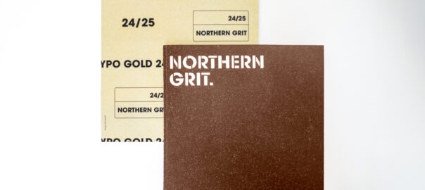
YPO Gold | Northern Grit
YPO is a global leadership community of over 35,000 chief executives. It is structured around chapters where local members come together for bespoke learning, social events and shared experiences in the same geographic area. Each year, a different member takes on the role of chairing the year’s calendar of events and produces a programme.
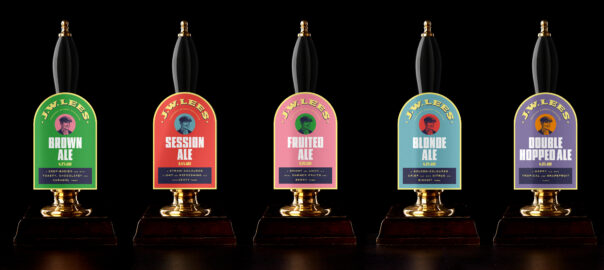
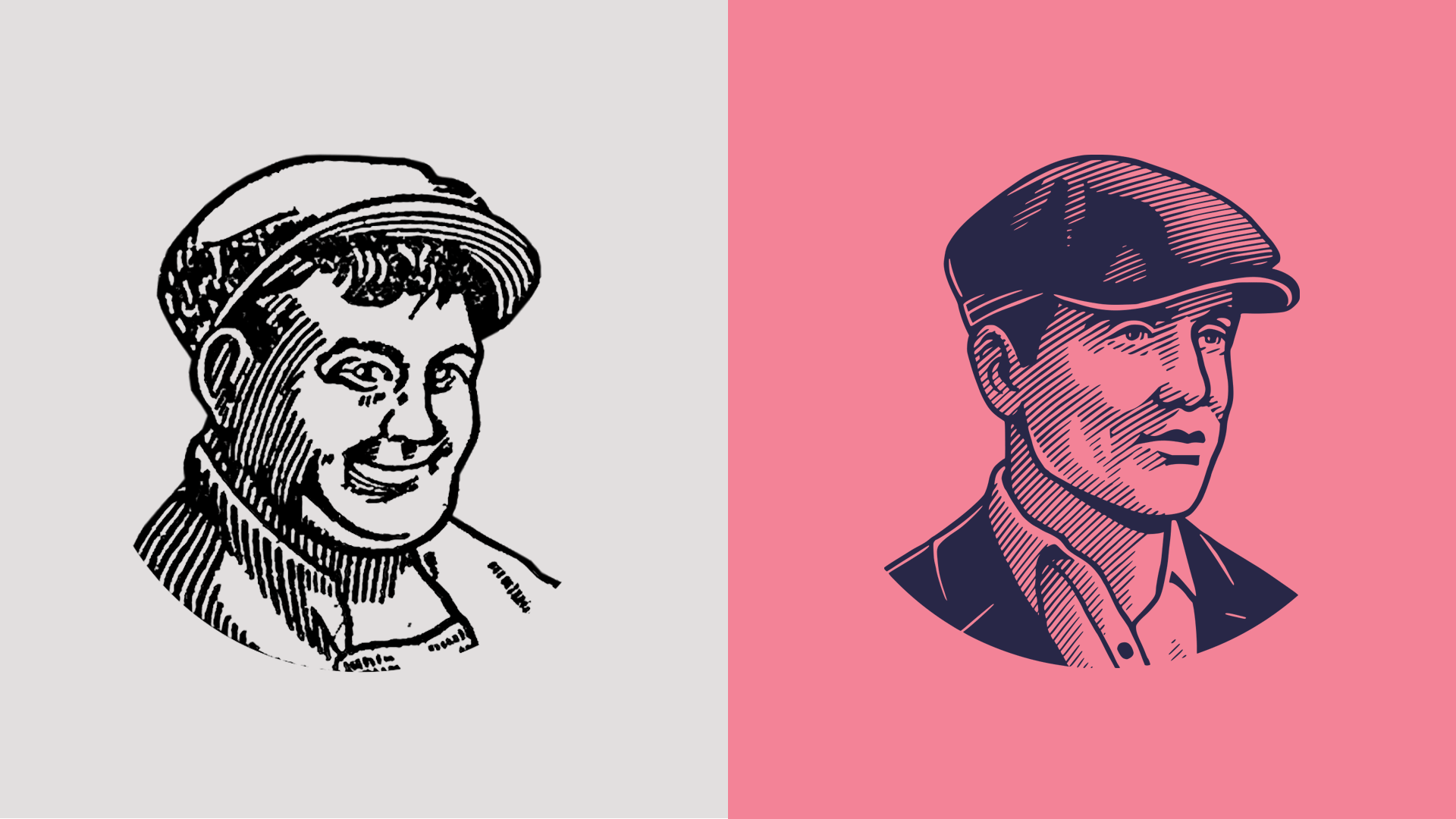
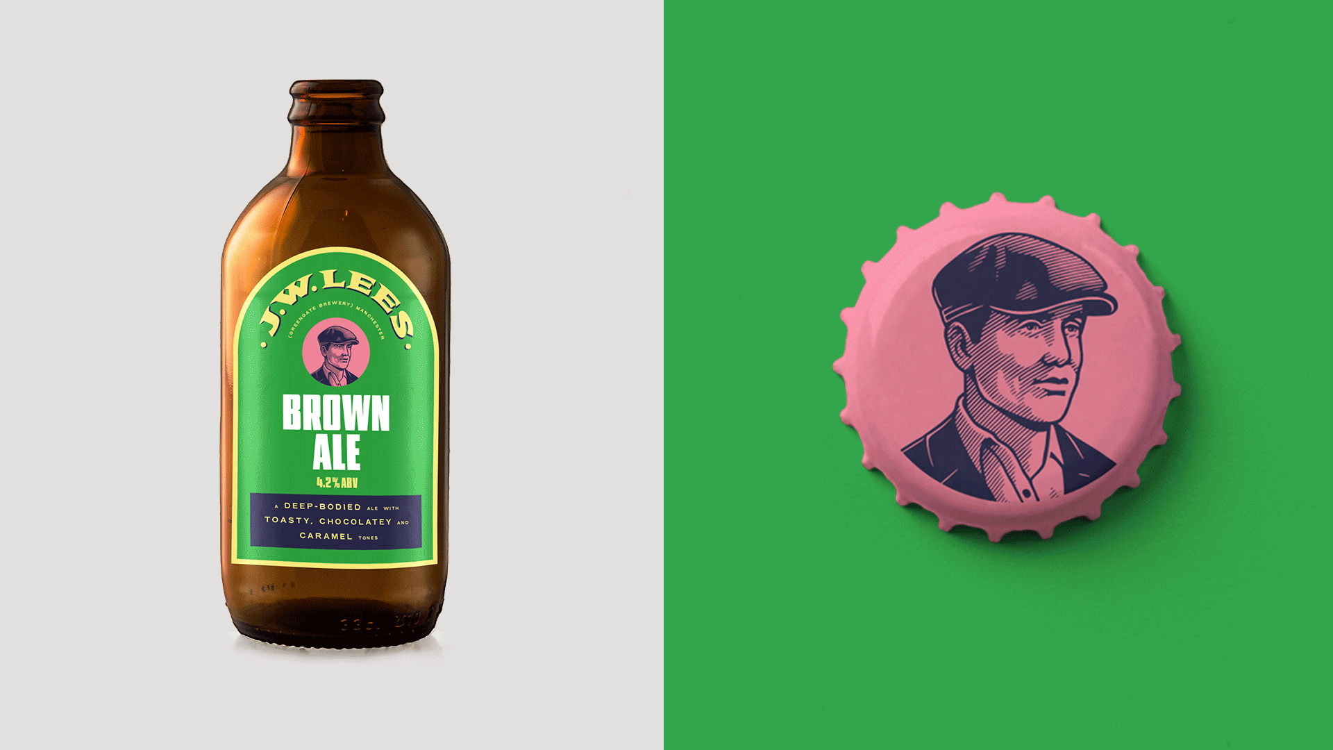
Putting together the programme is deeply personal, with events curated around a theme that the chair has chosen. When it was William Lees-Jones’ turn in the chair, he chose a theme reflective of his proud heritage: Northern Grit. Taking inspiration from William’s love of Manchester’s music scene, we adopted the industrial visual language of Madchester for the design of the programme.