JW Lees | Founder’s Hall


JW Lees | Founder's Hall

Sitting on Albert Square, Founder’s Hall is in an iconic spot in the shadow of Manchester’s Neo-Gothic Town Hall. The unique space is a testament to JW Lees’ past, present and future. It’s a story of tradition, innovation and a passion for beer that started in 1828 with the opening of Greengate Brewery at Middleton Junction, six miles from the centre of Manchester.

We were instructed to develop a new format from scratch for the former Dutton’s Manchester site and work with JW Lees on all aspects of it, from the name and branding, to interiors, food, drink and uniforms. JW Lees’ brief was for a venue that would celebrate nearly 200 years of brewing history and be a shrine to their full range of beers. Yet the requirement was to go beyond a traditional pub. The concept needed to sit comfortably in an urban building at the heart of a major city.

The space design and interiors scheme, which we worked on hand-in-hand with the JW Lees property team, is modern yet imbued with layers of time. It features materials, art and ephemera reclaimed from JW Lees’ brewery, mixed with a relaxed, industrial aesthetic conducive to clank and chatter, banter and grub – the atmosphere of a great pub but not a pub.

The branding used across the signage, interiors, website and marketing fuses the past and present, just like the interiors. At the centre of the mark is an illustration of John Lees created by Srdjan Vidakovic. The type follows our approach across the JW Lees brand of using display typefaces with an industrial heritage and plenty of muscle.

The name and concept for Founder’s Hall that we devised was rooted in honouring JW Lees’ founder, John Lees, in a modern food and beer hall environment. It’s a shrine to JW Lees’ beers, showcasing the vast range of cask ales, lagers, and Boilerhouse beers that we have branded over the last eight years. The menu features nibbles, bar snacks and small plates perfect for pairing with a few pints or sampling something new with a beer flight. The main event is hand-crafted pressed pies, as well as some JW Lees pub favourites.

Previous post

Christmas 2023
Christmas 2023


Christmas 2023

2023 is the year AI has cemented itself into our lives at pace. At work, we’ve embraced it in various ways, using it in everything from research and storyboarding to illustration and film production. It’s sped up and improved our work. But AI also has limitations.

This year’s Christmas card and the accompanying film of its production remind us of the craft skills we must hold close as we charge into the future. It would be easy for traditional artisans to be left behind as we rush to embrace shiny new technology. But in doing so, we leave people and skills behind, often not realising until it’s too late.

Karen Edwards of the Red Button Press in Liverpool printed the card. Karen is dedicated to preserving the art of letterpress, which is now on the endangered craft list. Karen used vintage wooden letters A and I to print on hand-cranked, pedal-powered printing presses named Ada, Tom and Babs, Ruth and Brian. David Barraclough shot photography of the production, and the Squad team used it to create a film of the process. The voiceover came from Ian, Gabrielle, Brian, Helen, James and George from Narakeet AI.

Previous post

JW Lees | Seasonals 2024


JW Lees | Seasonals 

Brewer JW Lees launches a limited edition range of beers yearly to create something different to its core range of ales and lagers. Five interesting new beers hit the bar for just two months each, so the beer and the designs must excite and inspire customers to add something new to their drinking repertoire.

The modern traditional brewer positioning — devised at the start of our JW Lees journey — has always driven our design decisions. We regularly sift and draw upon a wealth of archive material, but one particular set of old beer designs has sat at the top of the pile, waiting for its moment. Not only did this wonderfully idiosyncratic set of labels provide a starting point for our designs, but they also inspired the beer types. The trick was to modernise both without sacrificing what piqued our interest in the first place. 

Our initial focus was typography. We needed the type to feel modern and traditional and to land with a thud, something that's become part of the JW Lees visual language. We also replaced the old Lees logo with a reworked version of their current logo on a curve.

Modernising the flat-cap man meant making him look timeless. We wanted him to feel more youthful without becoming a flat-cap-wearing hipster. We collaborated with Srdjan Vidakovic to create a contemporary illustration without losing our man's soul.

Our extensive work on cask ale has revealed the importance of flavour notes for the modern drinker. So, we replaced the brewery details with the necessary beer-style descriptions.

The final task was to finalise a more cohesive colour palette than the archive set. We wanted to embrace the boldness but not fight with the JW Lees core beer range. The new colours link the beers but give each distinctiveness.

We designed every part of the new look to honour the past but make the beers feel like a fresh new choice in a pub today. Choosing how close or far to move from the archive material took an in-depth understanding of two hundred years of history and insight into today's cask ale drinkers. It builds upon a remarkable story; we'll raise a glass to that.

Previous post

Artisan Wines | Brand Identity


Artisan Wines | Brand Identity

Artisan Wines has a simple approach: authentic French wines produced by small, passionate producers, delivered with insightful tasting notes to customers’ doors. They seek distinctive hand-crafted wines in the £7 to £15 bracket, where the price-to-quality ratio is particularly strong. Customers get a great deal and a product they can’t buy on the high street.

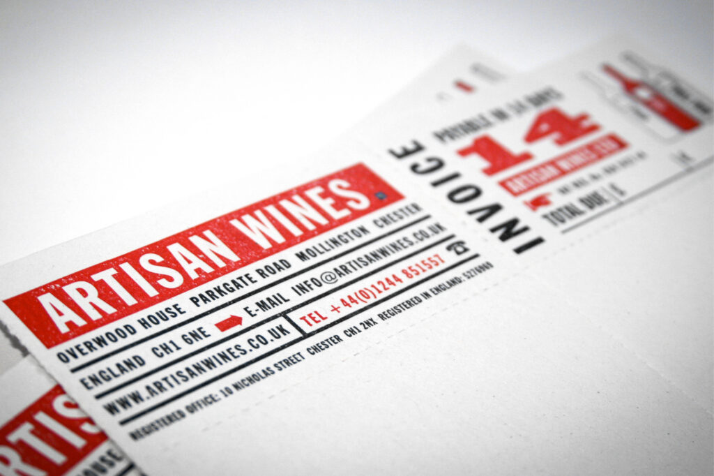
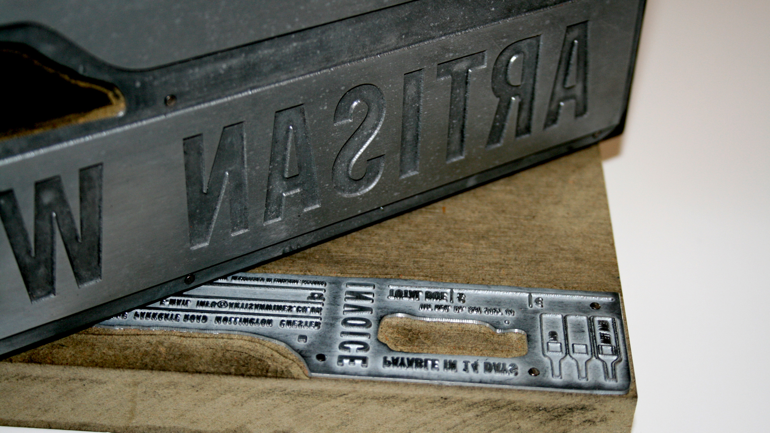
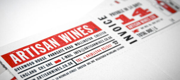
Everything about Artisan Wines is hands-on, from how they source their wines to the producers who make them. So, we turned to traditional letterpress techniques to create a wonderfully warm and imprecise look for the brand, adopting a bold typographic look. Our graphic approach pushed Artisan Wines away from the elaborate script typefaces so common in the wine sector.

We noticed that small blackboards in the producers’ cellars often sit next to the wine fermentation barrels; we utilised this imagery as a creative background for tasting note covers and direct mail.

Artisan Wines asked us for several printed pieces to sit in the delivery boxes. They were delighted and astounded when we told them we could produce much of their initial printed materials with just one sheet of A4 paper, cleverly perforated to make letters, compliment slips, tasting notes and invoices. This perforating, folding and binding with red elastic bands only added to Artisan Wines’ hand-crafted execution and the sense of a personal touch.

Previous post