All posts by squad

Move people with your vision


Move people with your vision

When Bill Shankly took over as manager of Liverpool Football Club, they were a second-rate side, languishing in the old Second Division.

By the time he left in 1974, they’d won three First Division titles, one Second Division title, two FA Cups and one UEFA Cup.

Unrecognisable from the deadbeat side he’d taken charge of in December 1959 – even down to their kit.

Because when Bill Shankly took over as manager of Liverpool, they didn’t play in their iconic all-red strip.

They played in white shorts and white socks, with white piping on their red jerseys.

But Bill had an idea.

Impressed by Real Madrid’s all-white kit, and using his gut instinct for colour psychology, he made a switch so powerful that it’s hard to believe it hasn’t always been that way.

One day, after training, Bill bounded into the players’ dressing room.

He threw a pair of vivid red shorts to one of his players.

“Get into those shorts and let’s see how you look,” instructed Bill.

Because he had a theory: red is for danger; red is for power.

And he didn’t just choose any player to model this new kit, he chose his captain, Ron Yeats.

The 6ft 2in fellow Scot he’d signed from Dundee United, a part-time slaughterman who was as strong as an ox and twice as wide.

The bemused centre-half duly obliged and donned the red shorts, with the addition of red socks.

As he walked down the steps towards the players’ tunnel, he could see his manager, and assistant Bob Paisley, in the middle of the pitch.

And as Yeats approached them, all in red, Bill exclaimed: “Christ, Ronnie, you look awesome, terrifying; you look seven feet tall!”

His stocky presence was made all the more imposing by the all-red uniform.

A move intended to strike fear and intimidation into the hearts of opponents.

Bill was happy.

And on the 25 November 1964, the man-mountain from the “Granite City” of Aberdeen, led out his teammates against Anderlecht in the first round of the European Cup.

All in red for the first time.

The art of theatre was not lost on Bill: he instructed Yeats to stand in the centre circle of the Anfield pitch.

“Walk around him,” urged Bill, as he invited a group of journalists to behold his rough-hewn granite obelisk.

Splendorous in scarlet.

The match was played at a cracking tempo.

Yeats the rock: a huge, defiant red-jasper sentinel in the middle of the defence.

Hunt, St John and Yeats on the score sheet: the captain’s forceful header, the skipper’s first at Anfield.

They shattered the pride of Belgium: 3–0.

And Bill knew that a red glow had been ignited at Anfield that night: one that burned fiercely for more than 20 years.

He knew the importance of getting people to sit up and take notice.

His symbolic move captured their supporters’ imagination, and that of the onlooking press too.

Projecting a very clear sense of who or what you are, and the purpose of what you are doing, is critical to success.

Connecting as much, if not more, on an emotional level as on a rational one.

Through the symbol of reevaluation: a red kit, Bill projected a powerful identity, not just a superficial image.

Bill was sending out a visual message to reinforce the changes he’d made to LFC’s training ground, training methods, footballing philosophy and ambition.

A move intended to amplify these changes.

And, in doing so, intimidate the opposition, inspire the press, captivate the fans and motivate the players.

He’d brought his vision to life so people could see it, understand it and get behind it.

And like Bill, we turn breakthrough thinking into real-world outputs that fuel action and drive change.

— DB

Work in permanent beta


Work in permanent beta

Jeff Bezos was working in finance in New York City when he had a great idea.

He came across the fact that web usage was growing at 2,300% a year.

He’d never heard of anything growing that quickly.

What if he could build an online bookstore with millions of titles?

Something that couldn’t exist in the real world.

He was just 30 and had been married for only a year.

He told his wife that he wanted to quit his job.

And do this crazy thing.

A startup.

That probably wouldn’t work.

But his wife told him to go for it.

So he did.

To start with Amazon sold only books.

Next, Amazon added music and video.

Then he asked his customers what else they’d like to buy from Amazon.

And an incredibly long list came back.

Of whatever people had on their minds when they responded to Bezos’ question.

And that sparked an idea.

People will want to use this newfangled e-commerce way of shopping for everything.

Today, Amazon sells almost everything.

Jeff Bezos’ willingness to think long term was matched by his willingness to think like it’s always “Day 1”.

The sign-off he concludes every annual letter to his shareholders with is:

“It’s still Day 1” of the internet and for Amazon.com.

Just as he did in his first annual letter in 1997.

Because Day 1 is startup.

The days when a new company is full of energy.

Ready and willing to move ahead with vigour.

For him, Day 2 is “stasis”.

Followed by irrelevance.

That’s why Amazon remains in a state of permanent beta.

“Beta” is a phrase used by software companies to indicate that the version of the product is not yet finished.

“Permanent beta” is the idea of constant adaptation.

It’s a time of perpetual experimentation and usage.

An imperfect product is released.

Feedback is harvested.

Bugs, problems and features are worked upon.

And the product evolves and improves.

Permanent beta can be an outlook on life.

And it’s how we approach our clients’ problems.

Failure isn’t something to avoid.

It’s a deliberate part of the process.

Working out what’s working and what’s not.

Failure isn’t an indication of capability or potential.

It’s simply an evaluation of progress.

Being in permanent beta forces you to acknowledge the bugs.

There’s always something to learn.

Something to adapt.

It’s a continuous commitment.

We’re always open to new ideas and iterations.

For us, the launch is the start, not the end.

We don’t just hand things over, we stay with our clients, watching, learning and refining along the way.

Amassing knowledge and experience while always retaining the energy, vigour and open-mindedness of Day 1.

— DB

Westmorland | Rheged Centre


Rheged Centre

What Tebay and Gloucester Services are for travellers, Rheged Centre is for visitors to Cumbria: it’s about showing off the best of a place, but also celebrating the things other people bring to that place.

It has a hugely diverse offering (including live theatre streaming, 3-D cinema, gallery spaces, fashion and outdoor retail, three different food and drink areas and children’s activities to name a few), and as a result our first task was to answer the question: ‘what is Rheged?’. Clarity was needed for staff as well as new and existing visitors.

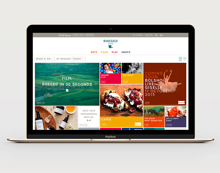
Our solution was to distill Rheged Centre down into four main categories, which acted as a simple shorthand: Arts/Food/Play/Shops. This shorthand enabled new visitors to understand at a glance the types of things they could expect to find on a day out at Rheged.
It also helped simplify the architecture for an overhaul to the website …

Homepage as box office

As Rheged Centre means many different things to many different people, we wanted to create a unique user experience that reflected this. It was identified that a key landing page for many of the sites existing users was the ‘what’s on?’ page, however, it was also one of the least interesting/inspiring pages on the site.

Our solution was to combine these two issues into one idea: a homepage that acted as a flexible box office, that could be customised to suit the needs of each individual user. In order to achieve this, we created a question that could be constructed in hundreds of different combinations. It’s default setting was ‘What’s On at Rheged Today?’.

As an example, a parent wanting ideas for days out during half-term might choose to ask the question: ‘Childrens’ Activities at Rheged This Half Term?’. As soon as the question is re-constructed, so are the tiles displayed underneath, creating a bespoke homepage suited to the individual user’s needs.
Integration with a new booking engine meant that without leaving the homepage, and with a single tap, a user could be purchasing tickets for an upcoming event–a huge leap forward from the existing site.

Results

  • Between 2012 and 2016 revenue increased from £47m to £93m.
  • Profits increased by 615% during the same period.


British Association of Aesthetic Plastic Surgeons

The British Association of Aesthetic Plastic Surgeons

The British Association of Aesthetic Plastic Surgeons (BAAPS) is a registered charity dedicated to the independent promotion of professional standards amongst its members, patient safety and education of the public about cosmetic surgery. Based at the Royal College of Surgeons, all its members are on the Specialist Register of Plastic Surgeons maintained by the General Medical Council.

BAAPS asked us to create an advert for them, in response to a growth in advertising they deemed inappropriate and irresponsible, trivialising what is a serious and life-changing process. Some of these included the offering of financial and date-linked incentives, digitally-enhanced images of models which give an unrealistic idea of what surgery can achieve, as well as using terminology that is exaggerated or ambiguous.

One particular example, a 2007 poster campaign on the London Underground, first prompted the BAAPS to start considering the idea of print ads: it showed an unhappy, flat-chested young woman in one panel, followed by the image of her smiling radiantly, with enhanced breasts, in another (‘Meet Amy before her breast enlargement. Meet Amy after’). The ad was banned after numerous complaints by the public and doctors.


Remodelling the identity
Before we could go about producing the ad, we put forward the case that the current identity had become disjointed over time, meaning that communications were not being delivered in the authoritative manner they could be. The better the impression we could make, the more likely people would be to take notice of the message.

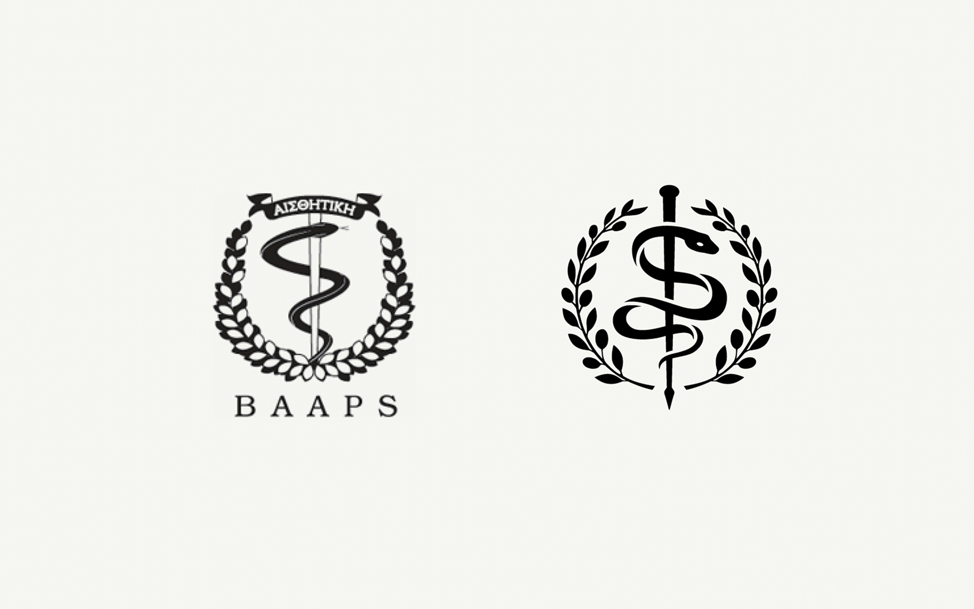
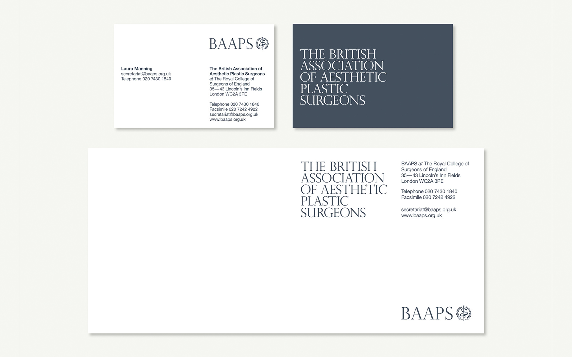
We carried out sensitive remodeling of the renowned crest – giving it a better balance and a more contemporary feel. It was produced as a vector line art illustration with clearer areas of space to allow for the reduction and enlargement without loss of detail. The new mark could easily be reversed out of a single colour or simple area of an image.

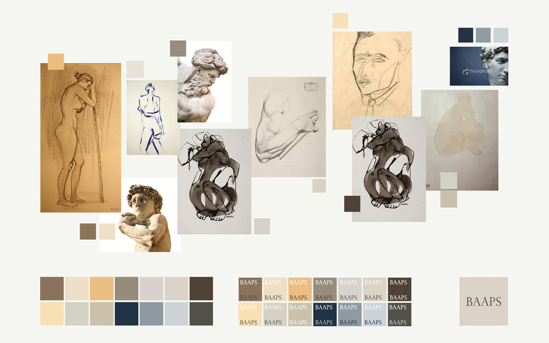
A classical palette
The new varied, but balanced, colour palette was inspired by classical art and sculpture. We reduced the choice of typeface to just one, Helvetica Neue – providing a distinction from the serifed acronym. Simple formats were created, that showcased the new crest and offer more flexibility of its placement in relation to the acronym and legend.

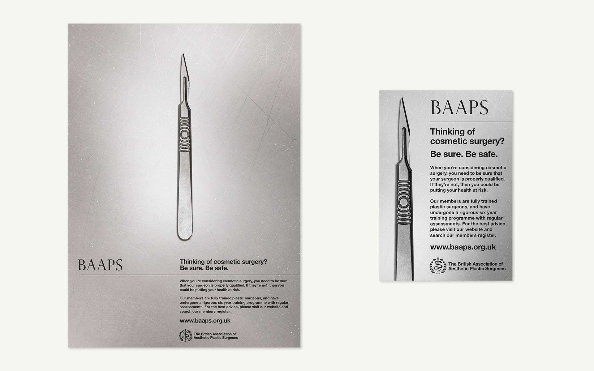
T Once the aesthetics were in order, the BAAPS campaign was devised to make a person considering cosmetic surgery, fully contemplate the competence of their choice of surgeon. By using an image of a scalpel we encouraged the viewer to consider who is holding this instrument: an instrument that in the right hands can work wonders, but in the wrong hands the consequences can be disastrous.

Reality in print
Using the scalpel at actual size heightened the sense of tension, making the instrument very real and potentially threatening. The use of gritty black and white takes away the glamour and presents the facts in a hard-hitting manner.

The BAAPS print ads first appeared in national women’s interest magazines such as Cosmopolitan, Marie Claire, Now, Glamour and Elle, and have since been adapted for online use.


“The BAAPS has been increasingly concerned about the standard and style of today’s cosmetic surgery advertising, designed to encourage and incentivise people to undergo procedures. Surgery is a serious undertaking which requires realistic expectations and should only proceed after proper consultation with a reputable and properly qualified clinician in an appropriate clinical setting. Our ad is designed to get patients to stop and actually thoroughly consider what’s involved, to ensure safe and happy outcomes.”

Douglas McGeorge – BAAPS