The British Association of Aesthetic Plastic Surgeons
The British Association of Aesthetic Plastic Surgeons (BAAPS) is a registered charity dedicated to the independent promotion of professional standards amongst its members, patient safety and education of the public about cosmetic surgery. Based at the Royal College of Surgeons, all its members are on the Specialist Register of Plastic Surgeons maintained by the General Medical Council.
BAAPS asked us to create an advert for them, in response to a growth in advertising they deemed inappropriate and irresponsible, trivialising what is a serious and life-changing process. Some of these included the offering of financial and date-linked incentives, digitally-enhanced images of models which give an unrealistic idea of what surgery can achieve, as well as using terminology that is exaggerated or ambiguous.
One particular example, a 2007 poster campaign on the London Underground, first prompted the BAAPS to start considering the idea of print ads: it showed an unhappy, flat-chested young woman in one panel, followed by the image of her smiling radiantly, with enhanced breasts, in another (‘Meet Amy before her breast enlargement. Meet Amy after’). The ad was banned after numerous complaints by the public and doctors.
Remodelling the identity
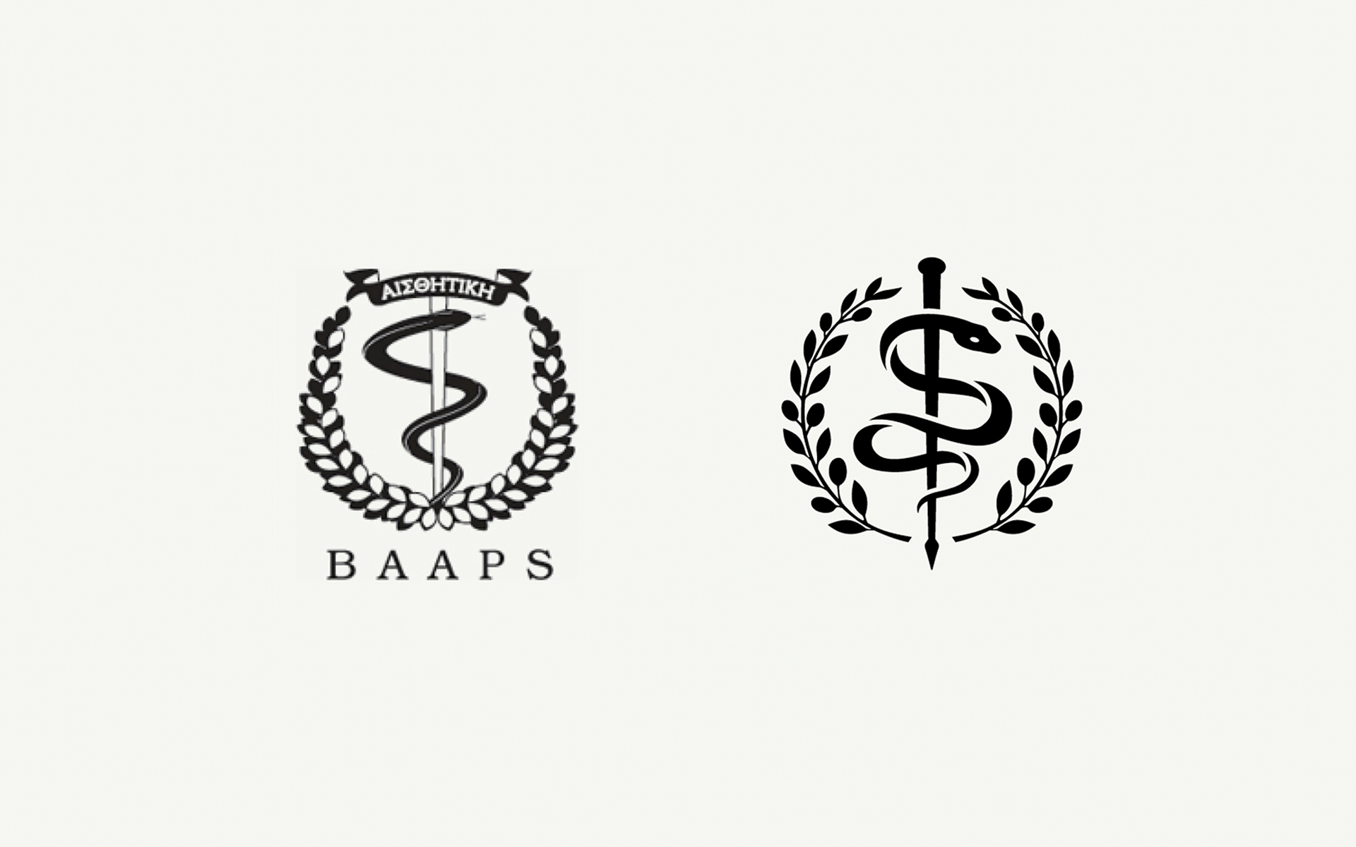
Before we could go about producing the ad, we put forward the case that the current identity had become disjointed over time, meaning that communications were not being delivered in the authoritative manner they could be. The better the impression we could make, the more likely people would be to take notice of the message.
We carried out sensitive remodeling of the renowned crest – giving it a better balance and a more contemporary feel. It was produced as a vector line art illustration with clearer areas of space to allow for the reduction and enlargement without loss of detail. The new mark could easily be reversed out of a single colour or simple area of an image.
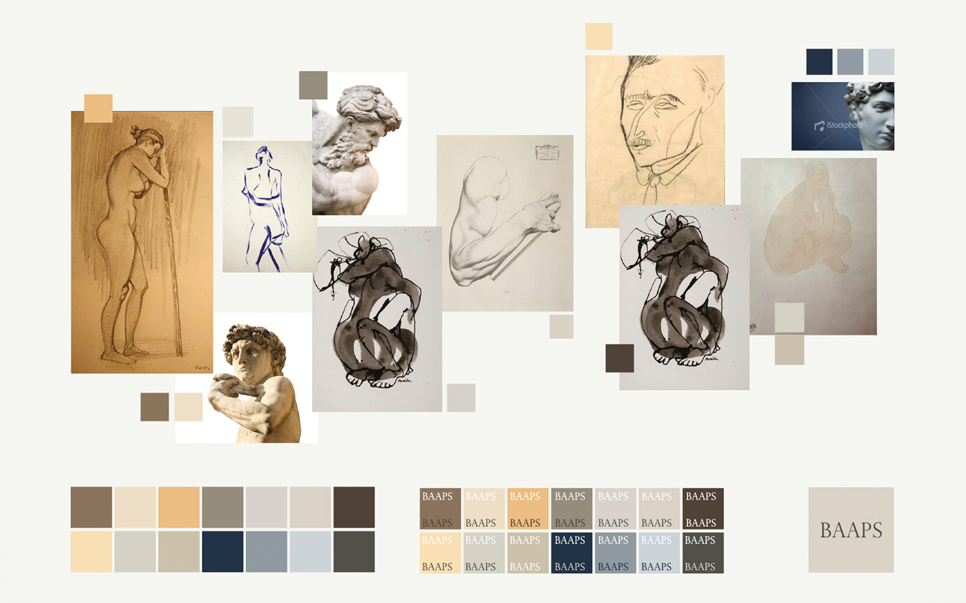
A classical palette
The new varied, but balanced, colour palette was inspired by classical art and sculpture. We reduced the choice of typeface to just one, Helvetica Neue – providing a distinction from the serifed acronym. Simple formats were created, that showcased the new crest and offer more flexibility of its placement in relation to the acronym and legend.
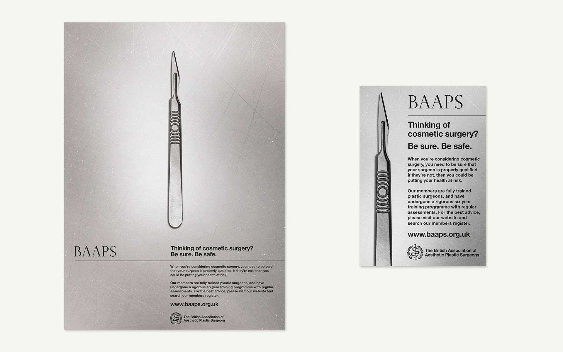
T Once the aesthetics were in order, the BAAPS campaign was devised to make a person considering cosmetic surgery, fully contemplate the competence of their choice of surgeon. By using an image of a scalpel we encouraged the viewer to consider who is holding this instrument: an instrument that in the right hands can work wonders, but in the wrong hands the consequences can be disastrous.
Reality in print
Using the scalpel at actual size heightened the sense of tension, making the instrument very real and potentially threatening. The use of gritty black and white takes away the glamour and presents the facts in a hard-hitting manner.
The BAAPS print ads first appeared in national women’s interest magazines such as Cosmopolitan, Marie Claire, Now, Glamour and Elle, and have since been adapted for online use.
“The BAAPS has been increasingly concerned about the standard and style of today’s cosmetic surgery advertising, designed to encourage and incentivise people to undergo procedures. Surgery is a serious undertaking which requires realistic expectations and should only proceed after proper consultation with a reputable and properly qualified clinician in an appropriate clinical setting. Our ad is designed to get patients to stop and actually thoroughly consider what’s involved, to ensure safe and happy outcomes.”
Douglas McGeorge – BAAPS
Subscribe to Squad

Get our annual printed newspaper plus our email digests full of inspiration, thoughts, tools and the interviews.
Subscribe

