Insight | Never Being Boring
Most people in the real world aren’t that bothered about brands.
They’re too busy doing what interests them.
To quote legendary ad man Howard Gossage: “Nobody reads advertising. People read what interests them, and sometimes it’s an ad.”
And it can be said of design, too.
It’s a sobering thought.
We must unearth ways of being part of what people find genuinely interesting.
The most interesting brands spark to life from
the edges.
At the intersections of:
strategy + creativity
position + personality
intellect + intuition
thinking + doing
substance + surface
physical + emotional
high art + low art
order + chaos
visual + verbal
what you say + how you say it
something from here + something from over there.
Traditionally, working practices separate what you
say and how you say it.
But we fuse the strategic and creative stages.
How we work brings forward and accelerates the magic from the myriad of decisions made during creative execution.
Students of the profession may recognise this approach from the Honda Book of Dreams —
Google it.
It’s interesting.
It created a way for strategic and creative people to collaborate on strategic and executional decisions before doing the actual work.
Decisions about fonts, colours and vocabulary became part of the upfront strategic conversation, creating a visceral understanding of a brand voice, not just what you say but how you say it.
We love that.
It’s a working method that collects quotes, images, poems, lyrics and doodles.
It’s all stuck on the wall, and we work out what feels like the brand and what doesn’t.
Care is taken not to narrow things down — not to try and create a singular style or tone but a ton of different approaches which all feel like the brand.
Then you make it into a book.
Or, as we sometimes do, a film.
Sounds easy?
Nope.
It means you need to be interested in everything.
As Russell Davies, the planner on Honda at the time, says: “It’s not about making yourself interesting. It’s about making the world interesting. And that means developing skills and habits around ideas, creativity and communication.”
As Russell’s book Do Interesting states on its cover:
Notice.
Collect.
Share.
It’s about having your radar up at all times.
It is developing your skills of memory and recall.
Or how to use a Pritt Stick and a scrapbook.
Always be collecting.
And it’s useless if you don’t pass it on.
It means it’s a richer way of thinking and doing for us.
Curating the most interesting and relevant stuff takes a sharp mind and eye.
And then we join the dots.
Or we whack it in the equivalent of a creative Large Hadron Collider.
That’s when it gets interesting.
We work with our clients to build the most interesting brands by doing the most interesting work of our lives, working in the most interesting manner possible.
That doesn’t necessarily mean we need to work with rock star brands; interesting can be found anywhere and applied to anything.
So we have a particular way of going about it.
Boring is our sworn enemy.
Interesting always takes a position.
Interesting has a personality.
Interesting can find a good idea anywhere.
Interesting keeps its eyes open and doesn’t fall
asleep in the car.
Interesting has continuity, not mind-numbing,
ruthless consistency.
Interesting might be even more important
than different.
You may have noticed that the headline on this page is a song title borrowed from the Pet Shop Boys.
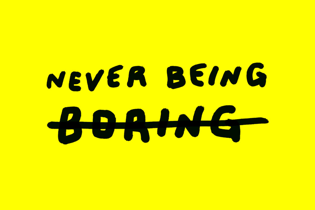
In the track’s stylish black and white video, directed by fashion photographer Bruce Weber, is the hand-scrawled quote: She was never bored because she was never boring.
We think that’s interesting.

