Pot Kettle Black | Rebrand
Coffee, brunch and breakfast restaurant Pot Kettle Black began life in 2013 with one venue in the Grade II listed Barton Arcade. Their original art nouveau-inspired identity responded to their grand surroundings.
But when we started working with Pot Kettle Black, their founders, Mark and Jon, were considering expansion. They needed to articulate their story to drive their growth. The platform we created directed everything from their pitch to landlords to their products and culture.
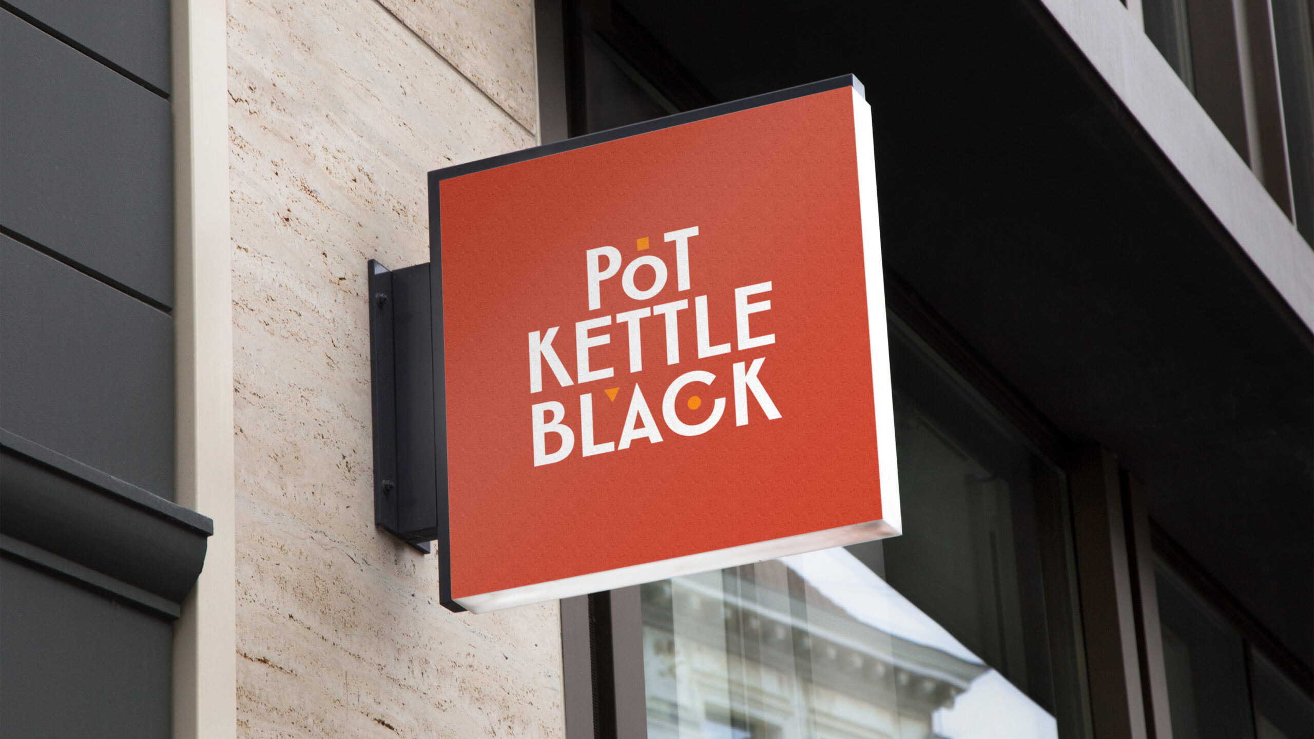
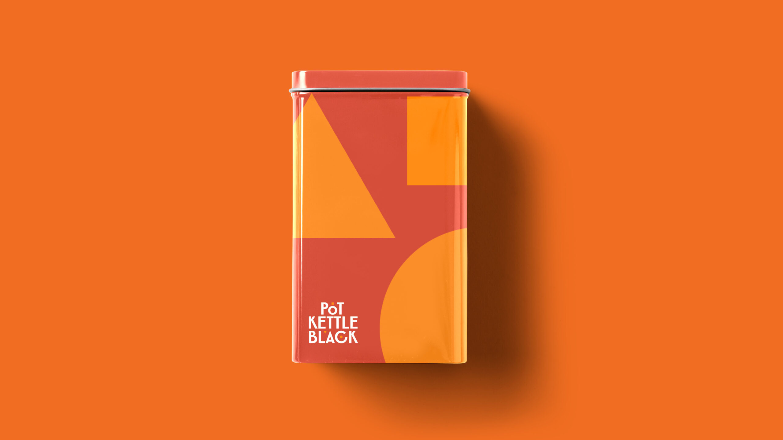
It was only natural that the identity would need a refresh, too. Rather than taking inspiration from the original surroundings, the identity needed to embody the new true north of the business. Our new identity preserved some of the characteristics of art nouveau typography but also drew from a mid-century style book. We chose the typeface for its quirks and hand-drawn imperfections. We sought to capture the sunniness and warmth at the heart of their new brand platform through an almost baked colour palette.


Subscribe to Squad

Get our annual printed newspaper plus our email digests full of inspiration, thoughts, tools and the interviews.
Subscribe


