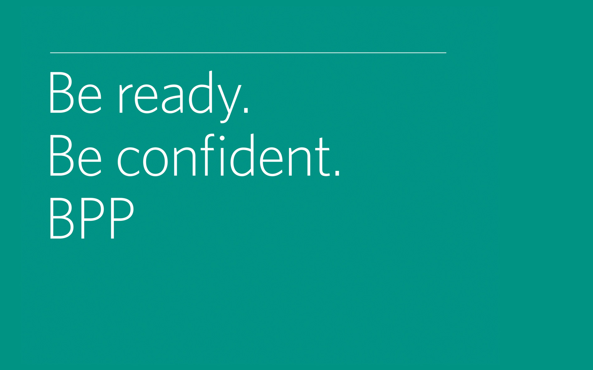
Get out of your depth
David Robert Jones was born 8 January 1947.
He died 10 January 2016, having challenged and changed popular culture.
A singer, songwriter and musician.
As well as an actor, painter, publisher, editor, curator and artist.
Shifting shapes from androgynous alien through to bandaged and button-eyed prophet.
David Bowie, as he became better known, created, adapted and untethered many alter egos.
The flame-haired, platform-booted alien: Ziggy Stardust.
Hedonistic astronaut, Major Tom.
The impeccably dressed and darkest of all his characters, the Thin White Duke.
His exploration of otherworldly personas fuelled by his skills in mime and cabaret and a restless intellectual curiosity.
His musical influences were plentiful: John Coltrane, Harry Partch, Eric Dolphy, The Velvet Underground, John Cage, Sonny Smith, Anthony Newley, Florence Foster Jenkins, Johnnie Ray, Julie London, the Legendary Stardust Cowboy, Edith Piaf and Shirley Bassey.
Not forgetting oompah brass bands, whale song, jungle and opera.
He collaborated with Moby, Trent Reznor, Adrian Belew, Peter Frampton, John Lennon and Iggy Pop.
His worked influenced hard rock, new wave synth-pop, and funk, to name but a few genres.
He was impossible to pigeonhole.
So many albums and genres of music, not to mention fashion styles.
Folk-glam, plastic soul, full-on pop.
David Bowie was one of the most original artists ever.
He preached the idea of always going that little bit further.
“When you don’t feel that your feet are quite touching the bottom, you’re in just about the right place to do something exciting.”
Of going further than you feel you’re capable of going.
If you feel safe in the area you’re working in, then you’re not working in the right place.
Go a little bit out of your depth.
It won’t always feel comfortable, but that’s part of the process.
Take risks; iterate fast; and dare to be different.
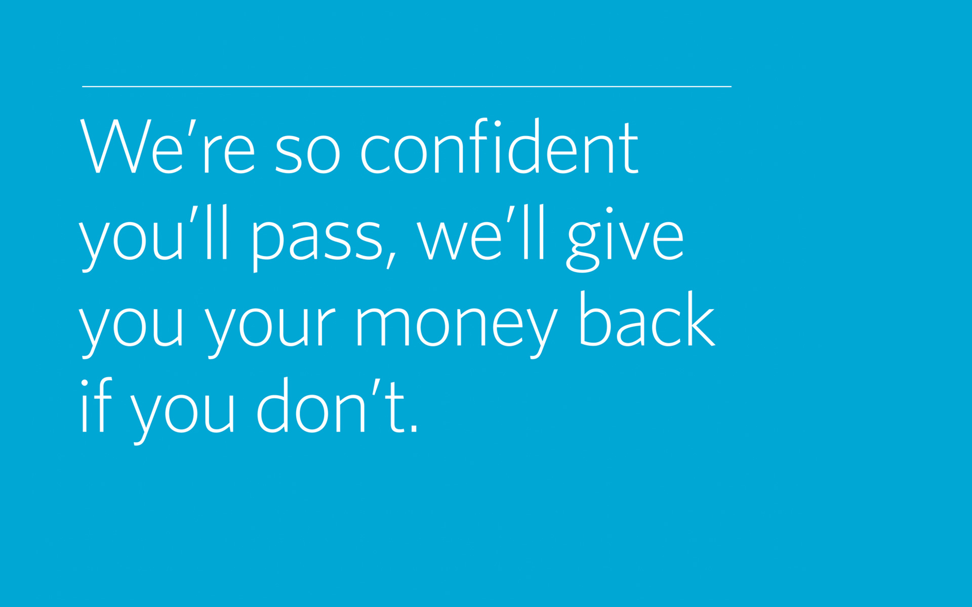
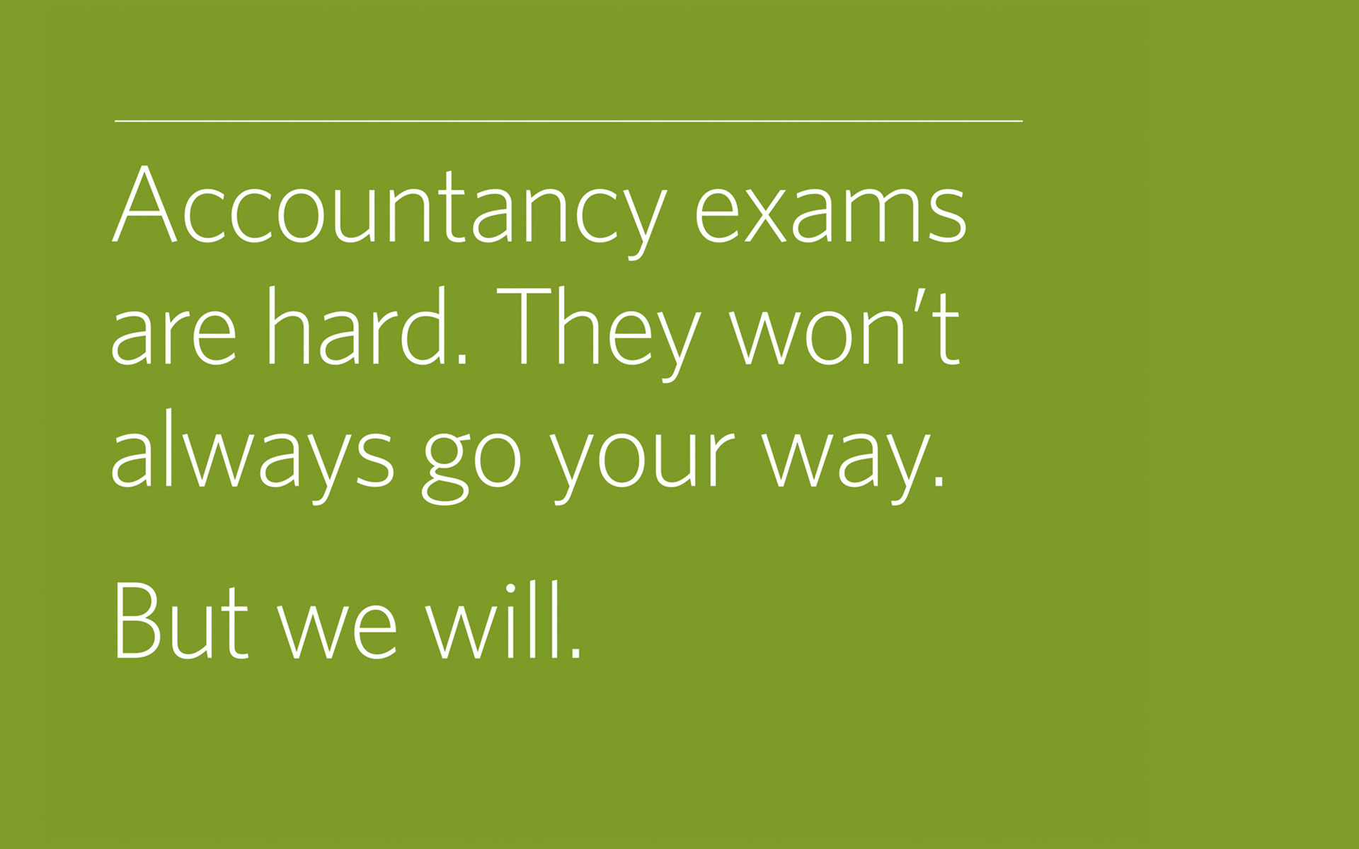
Naturally, taking risks is part of our business.
But it can be unnerving for a client.
The art of persuading a client to take the plunge lies in the tight alignment of strategy and creativity.
Relentless curiosity, commercial insight, research and analytics.
Gaining a deep understanding of untapped opportunities and the big issues.
Not by having wacky, creative brainstorms.
But by displaying to the client that we understand their business and their numbers, so that they are more prepared to take the creative leap.
To hold their nose and to jump in with both feet.
— DB