JW Lees | Seasonals 2020


JW Lees | Seasonals 2020

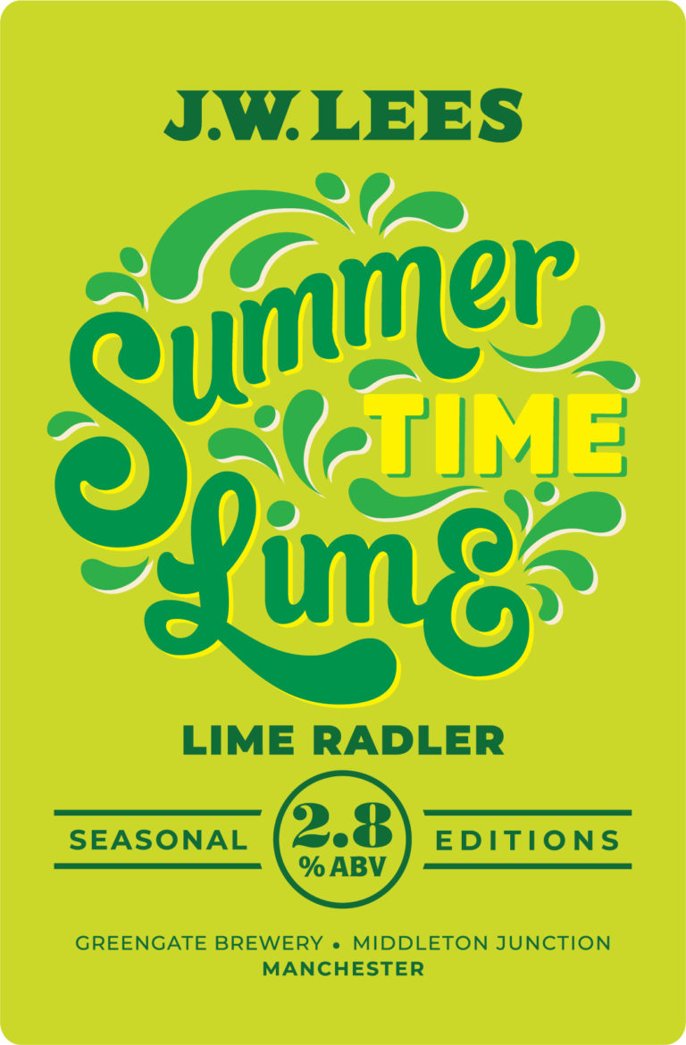
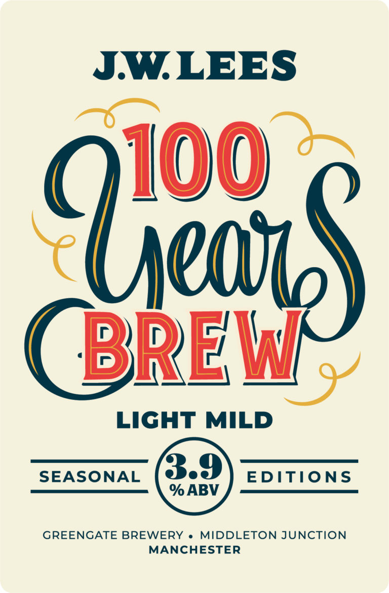
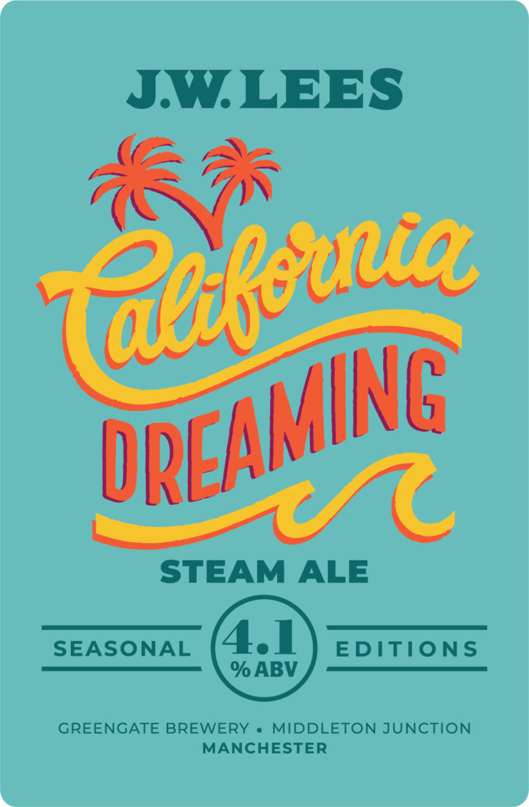
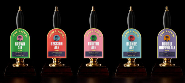
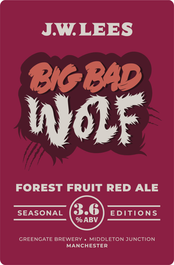
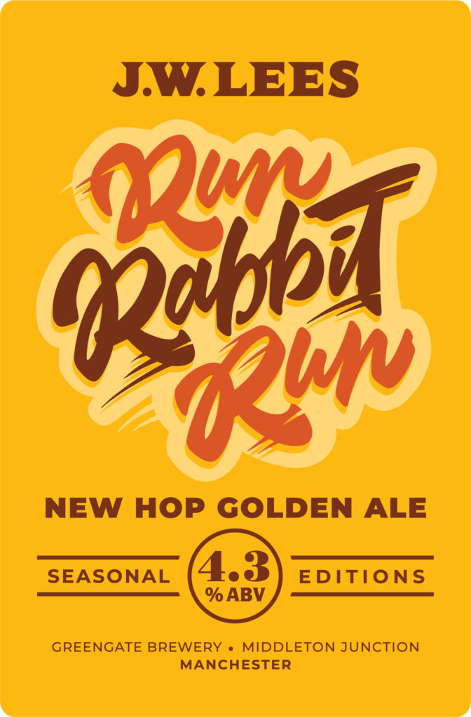
Each year JW Lees brew five limited edition beers to offer something new and different to their permanent range. In an extremely competitive market, it's vital they immediately stand out. However, the new brand strategy we introduced in 2017 was to create a family of beers that conveyed a stronger JW Lees brand. We needed a design solution that would make the seasonal beer range feel different yet still intrinsically JW Lees.


Guest typographers
The JW Lees beer identity celebrates deliberately diverse typography. By continuing with typographic designs, we could maintain the family feel of the beers. Where the core range favours muscular display fonts, many with industrial heritage, we brought in a guest lettering artist with a more fluid approach. Alison Carmichael's lettering ensures the beers stand out in the market, and from the core beers, as well as unifying the designs across the year. We also created names that linked to the time of year or beer style, and which made for distinctive, memorable bar-calls.
This is a great step forward in interesting and exciting cask ale, with beers that will stand out from the crowd.

Michael Lees-Jones – Head Brewer, JW Lees

Next post Previous post

Westmorland | Rheged Centre


Rheged Centre

What Tebay and Gloucester Services are for travellers, Rheged Centre is for visitors to Cumbria: it’s about showing off the best of a place, but also celebrating the things other people bring to that place.

It has a hugely diverse offering (including live theatre streaming, 3-D cinema, gallery spaces, fashion and outdoor retail, three different food and drink areas and children’s activities to name a few), and as a result our first task was to answer the question: ‘what is Rheged?’. Clarity was needed for staff as well as new and existing visitors.

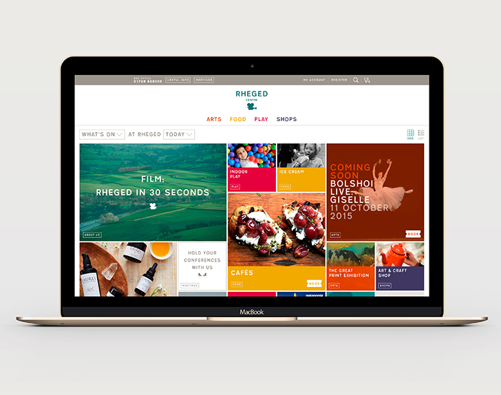
Our solution was to distill Rheged Centre down into four main categories, which acted as a simple shorthand: Arts/Food/Play/Shops. This shorthand enabled new visitors to understand at a glance the types of things they could expect to find on a day out at Rheged.
It also helped simplify the architecture for an overhaul to the website ...

Homepage as box office

As Rheged Centre means many different things to many different people, we wanted to create a unique user experience that reflected this. It was identified that a key landing page for many of the sites existing users was the ‘what’s on?’ page, however, it was also one of the least interesting/inspiring pages on the site.

Our solution was to combine these two issues into one idea: a homepage that acted as a flexible box office, that could be customised to suit the needs of each individual user. In order to achieve this, we created a question that could be constructed in hundreds of different combinations. It’s default setting was ‘What’s On at Rheged Today?’.

As an example, a parent wanting ideas for days out during half-term might choose to ask the question: ‘Childrens’ Activities at Rheged This Half Term?’. As soon as the question is re-constructed, so are the tiles displayed underneath, creating a bespoke homepage suited to the individual user’s needs.
Integration with a new booking engine meant that without leaving the homepage, and with a single tap, a user could be purchasing tickets for an upcoming event–a huge leap forward from the existing site.

Results

  • Between 2012 and 2016 revenue increased from £47m to £93m.
  • Profits increased by 615% during the same period.


Next post Previous post

British Association of Aesthetic Plastic Surgeons

The British Association of Aesthetic Plastic Surgeons

The British Association of Aesthetic Plastic Surgeons (BAAPS) is a registered charity dedicated to the independent promotion of professional standards amongst its members, patient safety and education of the public about cosmetic surgery. Based at the Royal College of Surgeons, all its members are on the Specialist Register of Plastic Surgeons maintained by the General Medical Council.

BAAPS asked us to create an advert for them, in response to a growth in advertising they deemed inappropriate and irresponsible, trivialising what is a serious and life-changing process. Some of these included the offering of financial and date-linked incentives, digitally-enhanced images of models which give an unrealistic idea of what surgery can achieve, as well as using terminology that is exaggerated or ambiguous.

One particular example, a 2007 poster campaign on the London Underground, first prompted the BAAPS to start considering the idea of print ads: it showed an unhappy, flat-chested young woman in one panel, followed by the image of her smiling radiantly, with enhanced breasts, in another ('Meet Amy before her breast enlargement. Meet Amy after'). The ad was banned after numerous complaints by the public and doctors.


Remodelling the identity
Before we could go about producing the ad, we put forward the case that the current identity had become disjointed over time, meaning that communications were not being delivered in the authoritative manner they could be. The better the impression we could make, the more likely people would be to take notice of the message.

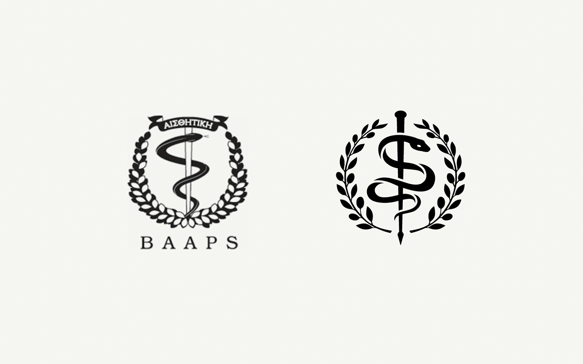
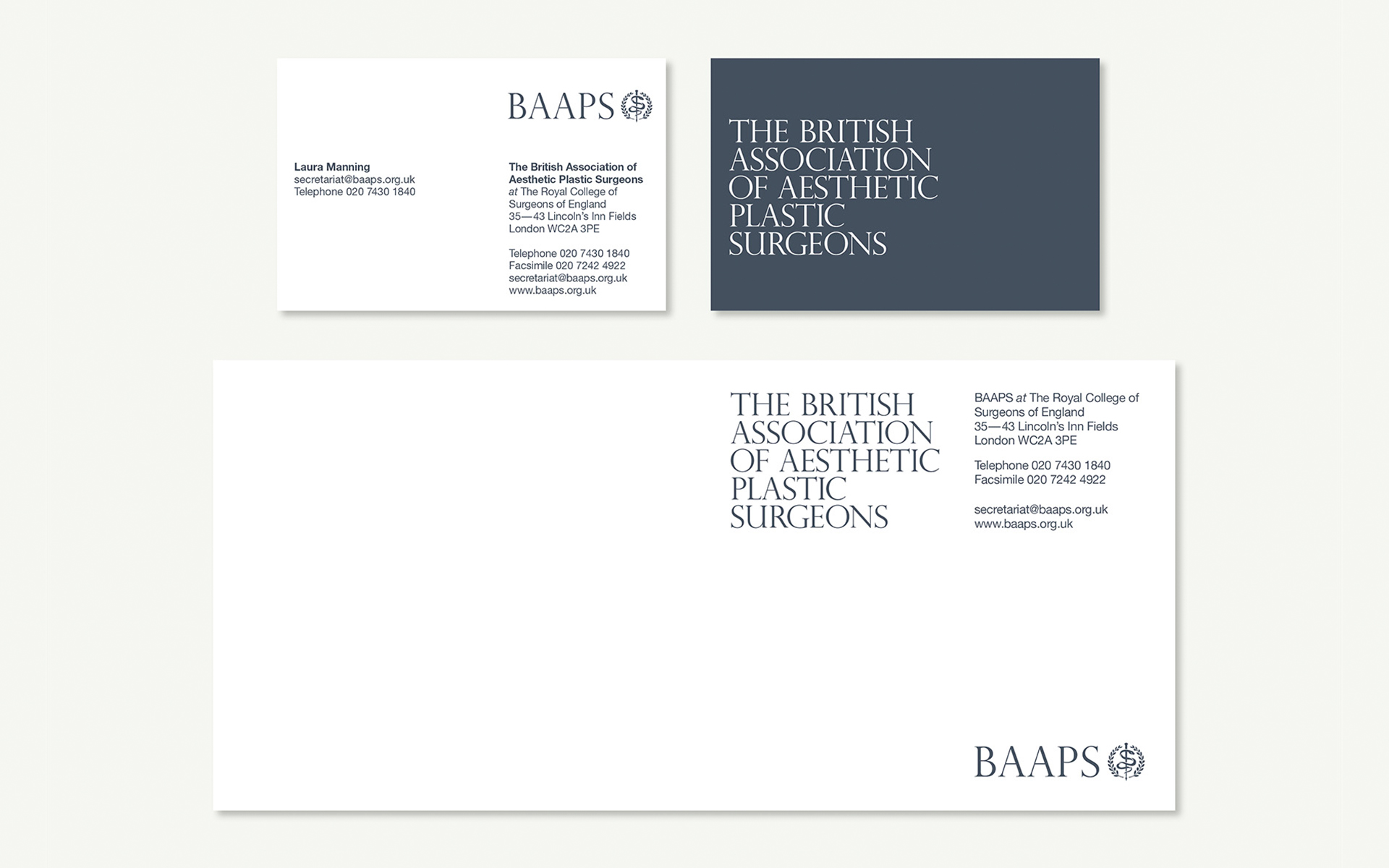
We carried out sensitive remodeling of the renowned crest – giving it a better balance and a more contemporary feel. It was produced as a vector line art illustration with clearer areas of space to allow for the reduction and enlargement without loss of detail. The new mark could easily be reversed out of a single colour or simple area of an image.

A classical palette
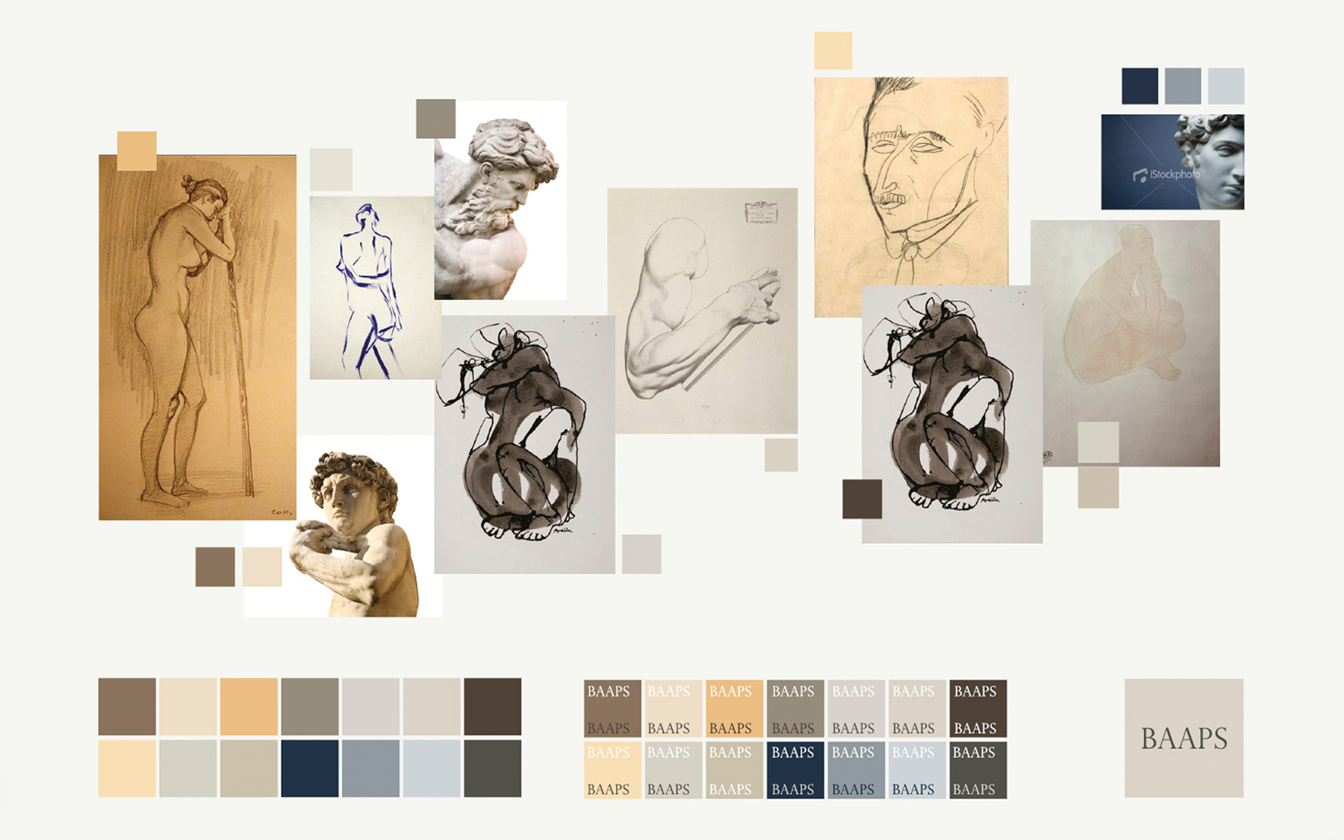
The new varied, but balanced, colour palette was inspired by classical art and sculpture. We reduced the choice of typeface to just one, Helvetica Neue – providing a distinction from the serifed acronym. Simple formats were created, that showcased the new crest and offer more flexibility of its placement in relation to the acronym and legend.

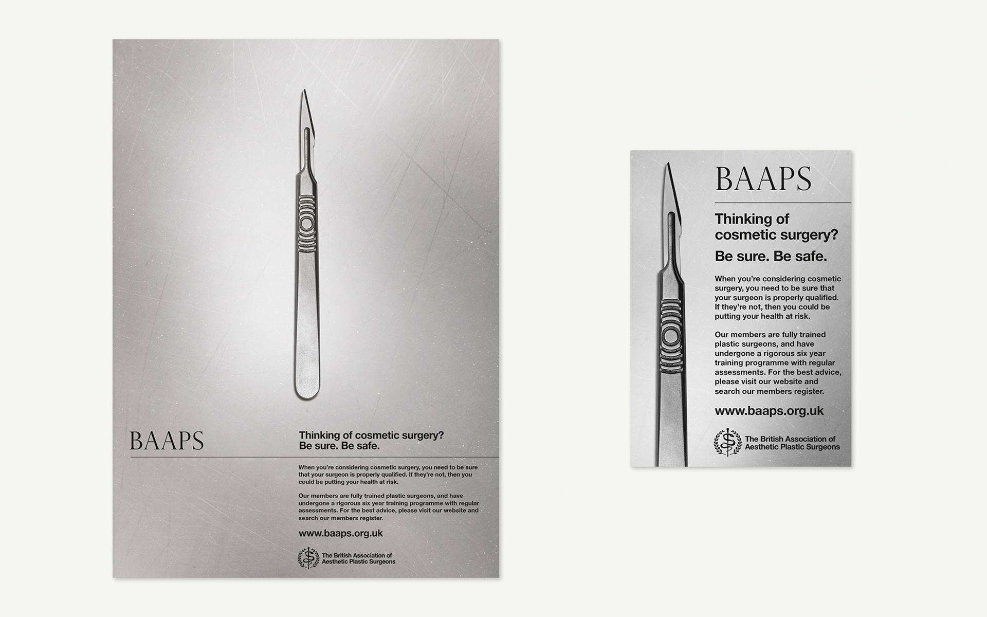
T Once the aesthetics were in order, the BAAPS campaign was devised to make a person considering cosmetic surgery, fully contemplate the competence of their choice of surgeon. By using an image of a scalpel we encouraged the viewer to consider who is holding this instrument: an instrument that in the right hands can work wonders, but in the wrong hands the consequences can be disastrous.

Reality in print
Using the scalpel at actual size heightened the sense of tension, making the instrument very real and potentially threatening. The use of gritty black and white takes away the glamour and presents the facts in a hard-hitting manner.

The BAAPS print ads first appeared in national women’s interest magazines such as Cosmopolitan, Marie Claire, Now, Glamour and Elle, and have since been adapted for online use.


"The BAAPS has been increasingly concerned about the standard and style of today's cosmetic surgery advertising, designed to encourage and incentivise people to undergo procedures. Surgery is a serious undertaking which requires realistic expectations and should only proceed after proper consultation with a reputable and properly qualified clinician in an appropriate clinical setting. Our ad is designed to get patients to stop and actually thoroughly consider what's involved, to ensure safe and happy outcomes."

Douglas McGeorge – BAAPS


Next post Previous post

Science Corridor
Science Corridor

Science Corridor

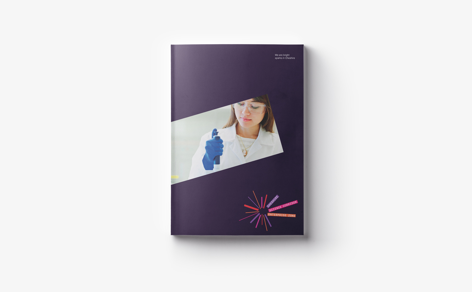
In the 2015 spending review statement, Cheshire was awarded its first enterprise zone. Cheshire LEP needed a new identity for the zone. But they needed it quick.

The benefits to a business of locating to an enterprise zone are business rate discounts or enhanced capital allowances. But beyond these immediate financial incentives and the excellent quality of life Cheshire affords, it is the potential synergies and opportunities that are fostered between so many established and emerging science businesses, and the energy created by amassing a pool of such unique talent.

Sparks fly

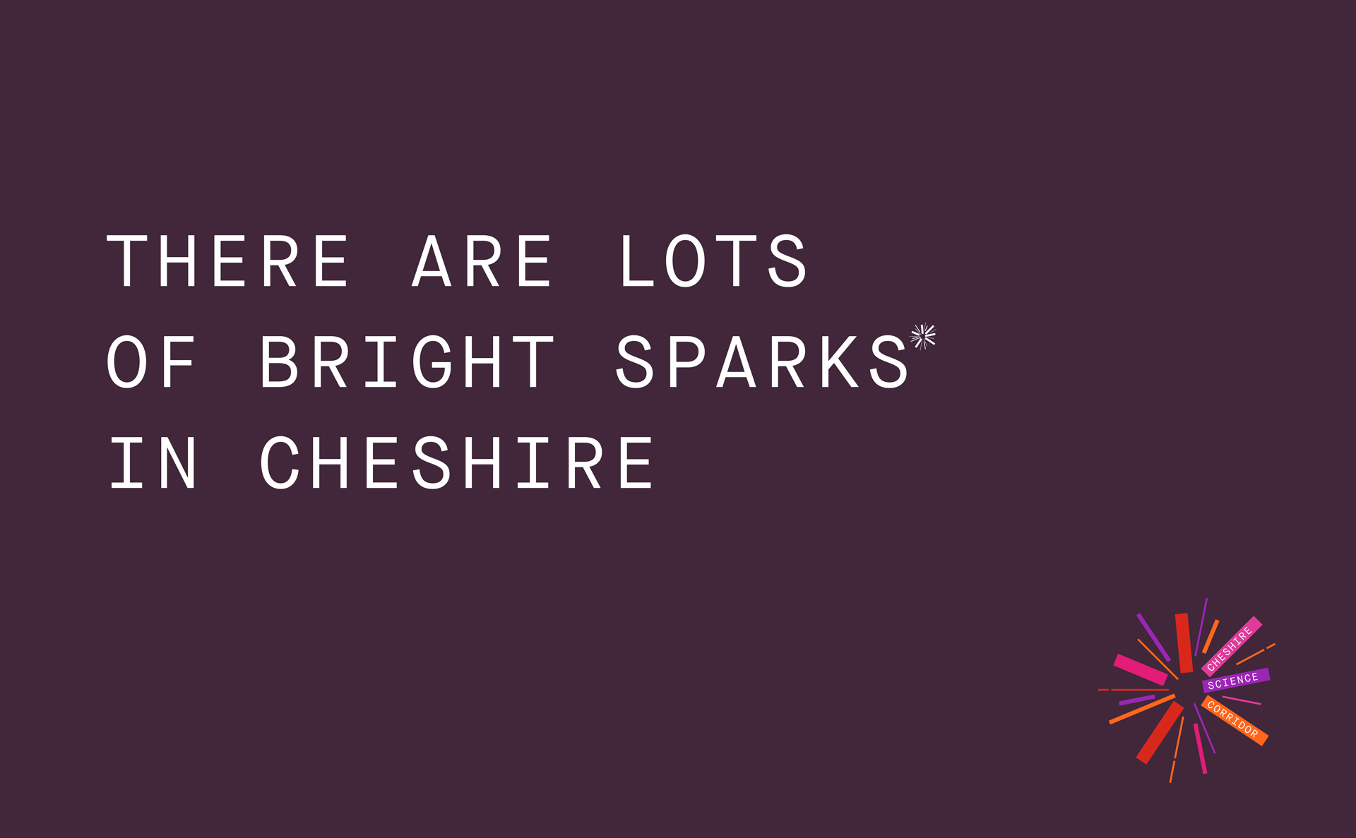
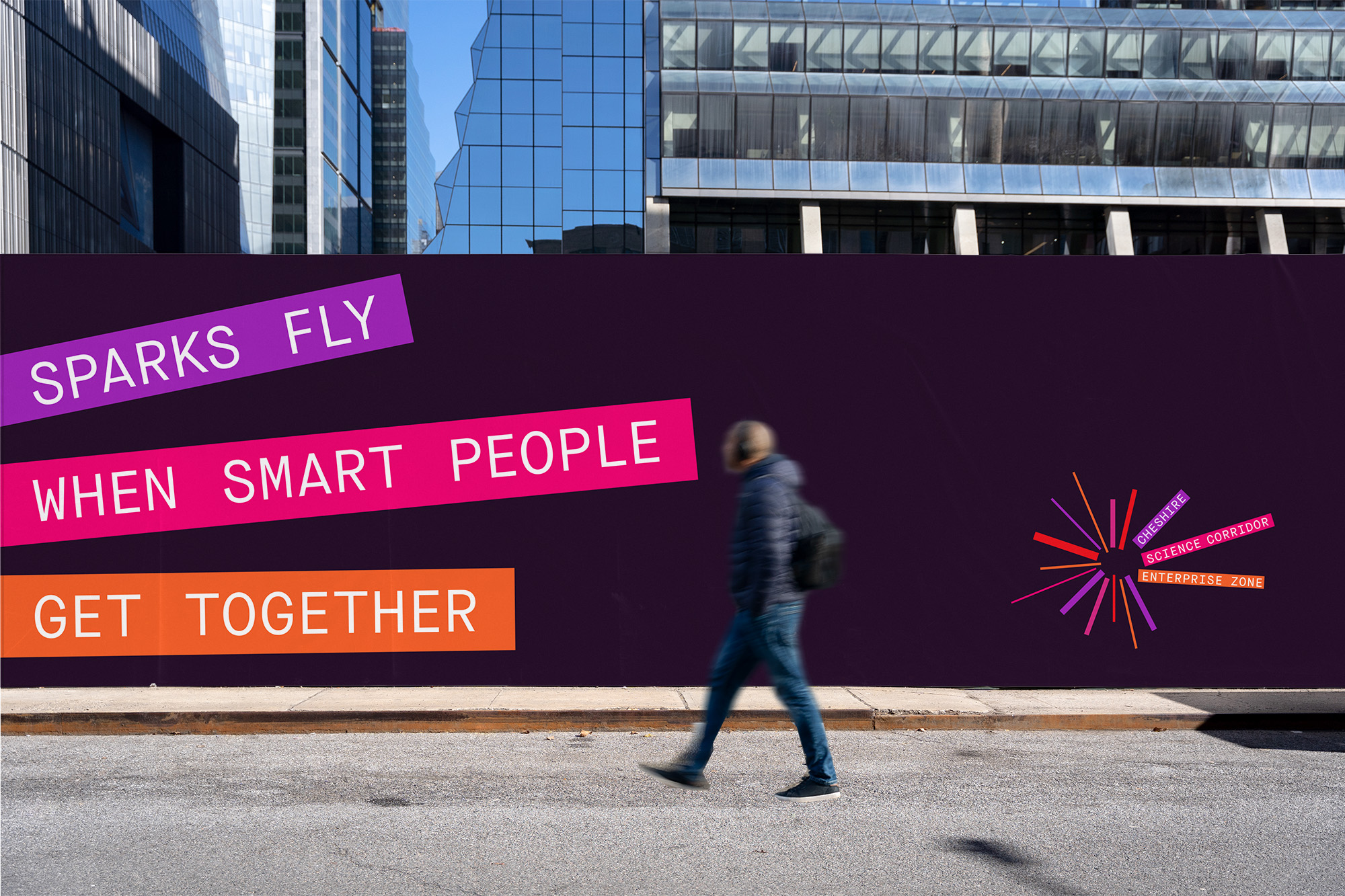
The strategic challenge was to distil the ambition of the Cheshire Science Corridor Enterprise Zone into a simple statement that would ignite the brand design. Cheshire is full of smart, scientific people. The opportunity for these scientific entrepreneurs and wealth creators to connect with each other and a ready-to-go skilled workforce, is the power of the science corridor. And when bright people hook up, amazing things can happen. We articulated our compelling new idea as: ‘sparks fly when smart people get together.’

This helped drive the brand expression. Our spark logo was designed to be memorable and flexible across many mediums, but we also wanted the mark to create the basis for a campaign-able identity that would act as a vehicle to carry messaging. This would make it easier for people to pick up the identity and run with it even if they only had the bare minimum building blocks of a brand identity. We also created a brand toolkit to get people up and running.

Equally importantly, our core idea gave the enterprise zone a sharp focus on fostering collaboration between its occupants. Something that would drive the ultimate financial success of the zone.

Next post Previous post