Trafford Developments
The Metropolitan Borough of Trafford in Greater Manchester is diverse. Urban and rural. It includes small villages and populous towns. Industrial and cultural. It’s home to the first industrial park in the world—and the most famous football club on the planet.
Trafford Developments


Subscribe to Squad

Get our annual printed newspaper plus our email digests full of inspiration, thoughts, tools and the interviews.
Subscribe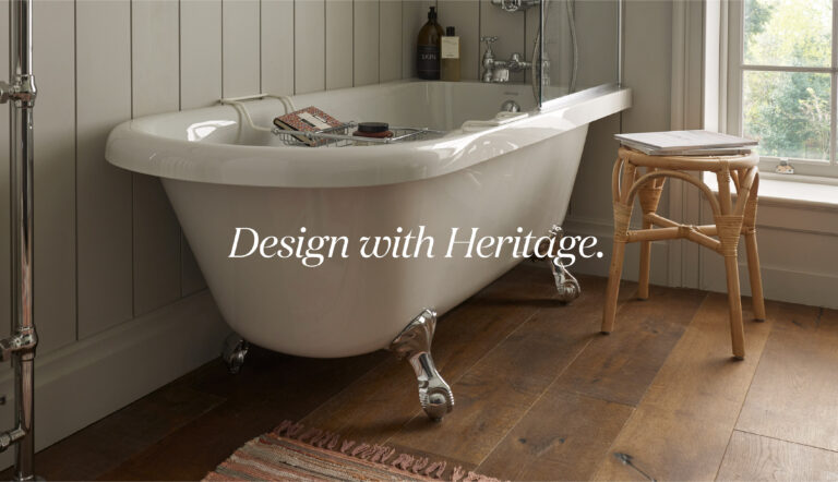
Bristan | Heritage Bathrooms
Heritage Bathrooms built a successful business and reputation on its traditional sanitaryware and brassware range. However, pressures from similar competitors were increasing, and traditional products account for a significantly smaller percentage of sales in the market than contemporary ones. Heritage needed to expand its range aggressively into new styles and furniture.
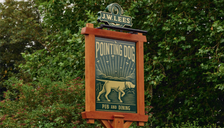
JW Lees
JW Lees was founded by a retired mill owner in 1828, an age in which working men would drink up to 12 pints a day. Five generations later, the 21st-century pub is a very different prospect, with changing demands and ever-increasing competition.


