Information Commissioner’s Office
The Information Commissioner’s Office (ICO) enforces and oversees the Data Protection Act and Freedom of Information Act. In 2010, a newly appointed Information Commissioner brought with him a fresh vision for the organisation – summarised as: ‘upholding information rights’. A new identity was required to signify that the organisation had a new purpose and a modernised approach.
Information Commissioner’s Office


Subscribe to Squad

Get our annual printed newspaper plus our email digests full of inspiration, thoughts, tools and the interviews.
Subscribe
Information Commissioner’s Office
On 25 May 2018, the General Data Protection Regulation (GDPR) came into effect, representing an evolution in the UK's data protection laws. This took place against a backdrop of huge public interest in privacy, following controversial stories in the media about how organisations are using personal data in ways that many would not expect or know about. It would be vital to present the regulations as a force for good in tackling these issues, and not as red tape.
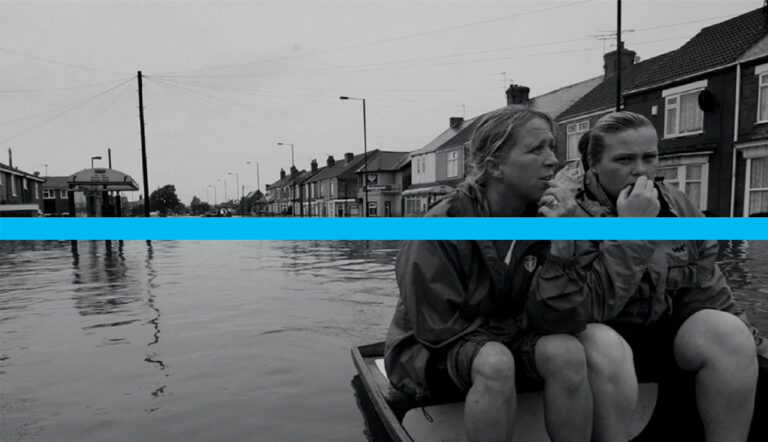
Environment Agency
A total of 5.5 million properties in England and Wales are at risk of flooding. But only 7% of people in communities at risk of flooding think that they are in danger. Our goal was to help the Environment Agency persuade people to be well prepared, and in doing so increase levels of resilience.


