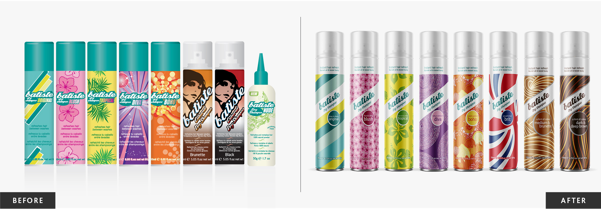
Batiste Dry Shampoo
Batiste Dry Shampoo has an innovative ‘no water needed formula’. For over 40 years it has provided a way to quickly revitalise hair between washes. While the product had a cult following amongst festival-goers and professional stylists, it had begun to look tired, and retailers had fallen into the habit of tucking it away on their bottom shelves. To increase sales the brand needed to rise up the fixture.
Batiste Dry Shampoo

Subscribe to Squad

Get our annual printed newspaper plus our email digests full of inspiration, thoughts, tools and the interviews.
Subscribe
Bionsen
Bionsen is the UK’s leading aluminium-free and paraben-free deodorant. Unfortunately, Bionsen is a big fish in a small pond since the antiperspirant market is 40 times the size of the deodorant market. Growth would have to come from persuading people to switch from antiperspirants. Our challenge was to convince people that sweating is not only normal but better.
Super Facialist
Women’s skincare brand Super Facialist approached Squad with aspirations to wipe the smile off the big brands’ faces. But their budget is only a fraction of L’Oreal, Nivea, Garnier, Olay or No7’s. Our goal was to position Super Facialist as a leading challenger brand. Doing more with less meant disrupting the category conventions to connect with everyday women.


